Realization
Helping Palmolive
Go Green
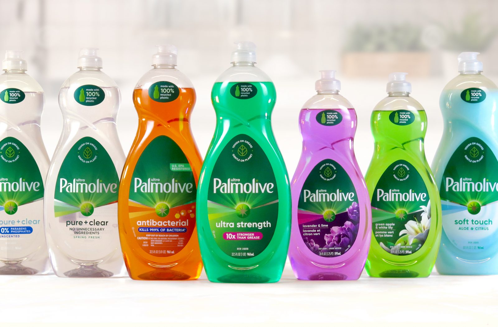
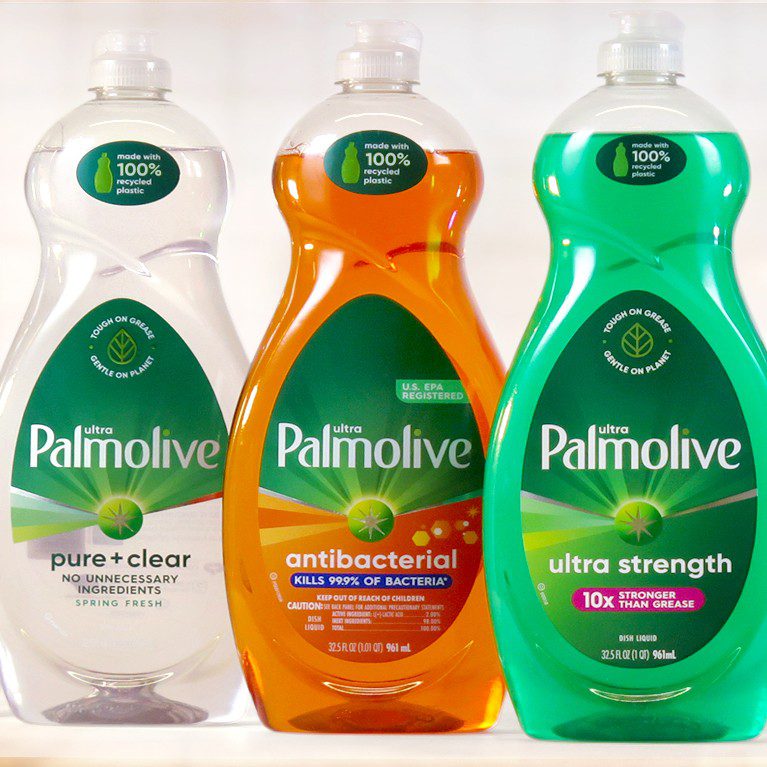
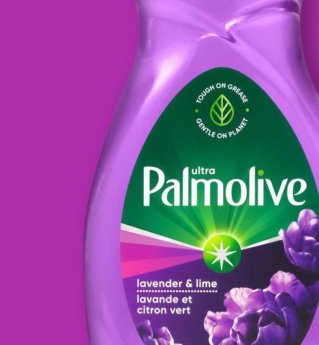
Palmolive Dish Soap has been a trusted heritage brand since the late 1800s, but its packaging has been locked in time giving the brand an outdated look on shelf.
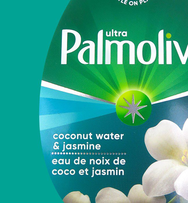
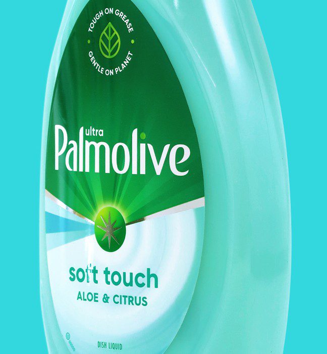
In order to compete in an increasingly crowded shelf space, Colgate restaged the label with a sophisticated vector-shaped design system through the use of vibrant color and foil accents.
DESIGN ACTIVATION
Approach
Inwork used a cold foil print technique to create sales samples and print targets across 8 distinct variants.
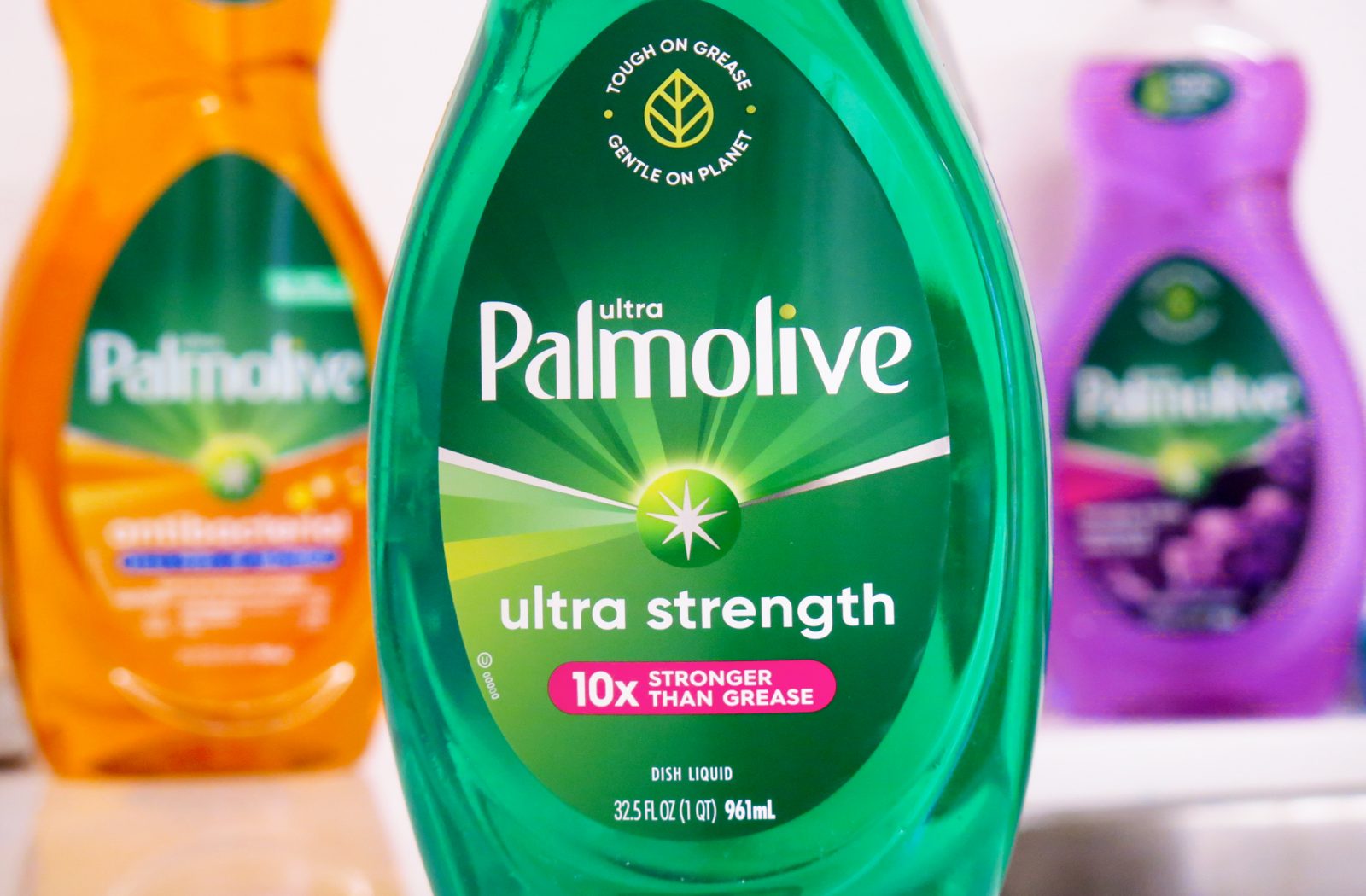
Each label includes 3 triangular vectors which nods to the efficacy and uniqueness of the Palmolive Brand.
The end result, a beautiful label with consistent green across the brand zone and simple variant segmentation through the use of color.

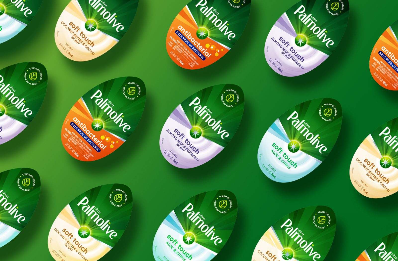
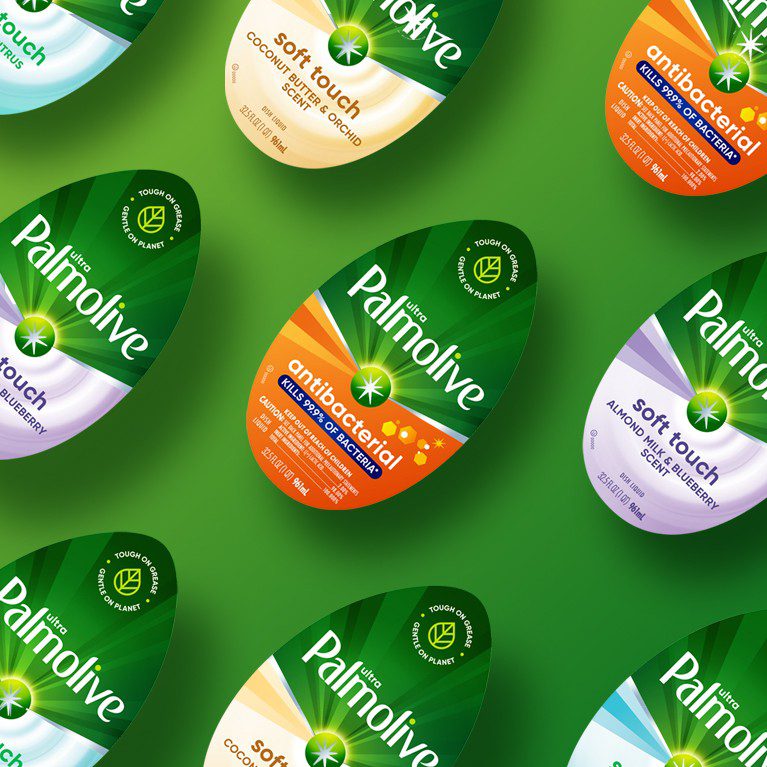
Modern vector-shaped design system through the use of vibrant color and foil accents

Unique vector-shaped rays provide vibrant color and foil accents


Explore green equity colors to increase environmentally friendly appeal
“Our new designs for Palmolive bring our vision to life and can be replicated for mass market, ensuring emotional connection to our consumers for years to come”